
Is your house looking a bit, well, tired beige? Don’t worry, fellow curb appeal champions! 2025 brings a burst of fresh colors to your home’s exterior. We’re talking about everything from calming greens to head-turning statements. There’s a perfect shade for every style, so grab a coffee, cozy up, and transform your house from drab to fab with these top 10 paint colors.
Warm Whites: Banishing the Bland
Move over, stark white. This year, it’s all about warm whites that exude a sense of sophistication and comfort. Think creamy hues with subtle hints of yellow or beige, like Cloud White. These colors brighten your exterior without the harshness of pure white and pair beautifully with various accent colors, from deep blues to earthy brown paint colors.
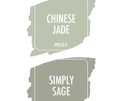
Nature’s Embrace: Soothing Greens Take Center Stage
Bring the outdoors in with a nature-inspired green. This trend reflects a growing desire for connection with the natural world, and it’s a fantastic choice for creating a calming and inviting atmosphere. Colors like Sherwin-Williams’ Evergreen Fog add depth and dimension to your exterior, while still feeling fresh and modern.
The Gray Area: Finding Balance with Off-Whites and Subtle Grays
Can’t decide between warm and cool? This trend is for you! Off-whites with subtle gray undertones offer the perfect middle ground, providing a hint of sophistication without going full-on gray. Valspar’s Silver Strand is a great example, and they complement a wide range of architectural styles, from traditional to contemporary.
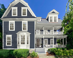
A Hint of Blue: Whispers of Tranquility
Blue hues have always been popular choices for exteriors, and in 2025, the trend continues with a softer touch. Think muted blues with a hint of gray or green, like Benjamin Moore’s Hale Navy or Sherwin-Williams’ In the Navy. These colors add a touch of personality without being overwhelming, and they create a sense of peace and tranquility.
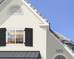
The Classics Never Go Out of Style: The Enduring Appeal of White
Classic white will never truly go out of style, and for good reason. It’s crisp, clean, and timeless, and it instantly brightens your exterior. If you’re looking for a traditional look with a modern twist, consider pairing white with bold black accents like shutters or a front door. This high-contrast combination creates a dramatic and sophisticated statement.

Punchy Statements: Front Doors Take the Spotlight
Looking to add a pop of personality to your house? Your front door is the perfect canvas! This year, bold and unexpected colors are all the rage. Think teal, cobalt blue, or even a fiery red. Just remember to choose a color that complements your overall exterior color scheme and architectural style.
Neutrality with a Twist: The Rise of Neutral Trim
While white trim has been the standard for years, neutral grays are slowly gaining traction. This trend offers a more modern and sophisticated look, and it can help to highlight the architectural details of your home. Behr’s Silver Shadow or Sherwin-Williams’ Repose Gray are popular choices, and they pair beautifully with a variety of exterior paint colors.
Dark and Dramatic: Embracing the Moody Side
For those who prefer a bold and dramatic look, darker colors are making a comeback. Think charcoal gray, deep blue, or even black. These colors can be striking and eye-catching, but it’s important to use them sparingly and consider the size and style of your home. They work best on larger homes with modern architectural features.
A Touch of Pink paint colors: Blushing Beauty Takes the Stage
Pink might not be the first color that comes to mind for exteriors, but hear me out! Soft, muted pinks with a hint of gray or beige are a surprisingly versatile choice. They can add a touch of whimsy and charm to your home, and they pair beautifully with white trim and natural elements like stone or brick. Benjamin Moore’s Pink Whisper or Sherwin-Williams’ Romantic Rose are great examples, and they’re perfect for creating a unique and memorable first impression.
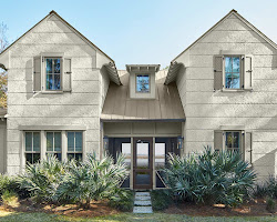
Earthy Elegance: Terracotta paint colors Takes Root
Terracotta is a warm, earthy hue that evokes a sense of rustic charm. It’s a fantastic choice for homes with natural elements like stone or wood, and it creates a warm and inviting atmosphere. Behr’s Terra Cotta or Sherwin-Williams’ Brick Red are popular choices, and they pair beautifully with cream-colored accents and lush greenery.
Choosing Your Perfect Palette of paint colors: 8 Quick Tips
- Mood Matters: Set the vibe! Warm colors (yellows, oranges) energize, while cool colors (blues, greens) soothe.
- Light it Up Natural and artificial light play tricks on color. Test swatches throughout the day to see the true hue.
- Size Matters: Darker colors can shrink a room, while lighter shades make it feel bigger. Choose accordingly!
- Furnishings First: Consider existing furniture and artwork. The paint should complement, not clash.
- Sample, Sample, Sample: Don’t trust the tiny paint chip! Apply test swatches on large poster boards to see how the color interacts with your space.
- Trim Talk: Don’t neglect trim! White trim can modernize any color, while bolder choices can add personality.
- Embrace the Unexpected: Don’t be afraid to experiment! A splash of color on an accent wall can add personality and drama.
- Seek Help (Optional): If overwhelmed, consult a color consultant! They can help navigate the vast world of color and find the perfect shade for your space.
Why do exterior paint colors matter?
Energy Efficiency:
- Light colors: Reflect sunlight, reducing heat absorption which can lower cooling costs in warmer climates. (Think whites, light beiges, or pastels)
- Dark colors: Absorb sunlight, potentially increasing heat gain and raising cooling costs. (Think deep blues, blacks, or dark browns)
2. Durability of paint colors:
- Lighter colors: Generally tend to fade less than darker colors due to the way they interact with UV rays.
3. Maintenance:
- Darker colors: May show dirt and grime more easily, requiring more frequent cleaning.
4. Architectural Style:
- Certain color palettes can complement or clash with different architectural styles. For example, a vibrant yellow might appear out of place on a Victorian home, while a deep gray might suit it well.
5. Neighborhood Harmony:
- While expressing your personal style is important, some communities have HOA guidelines regarding exterior paint colors to maintain a cohesive aesthetic.
6. Resale Value:
- While not a guarantee, neutral colors are generally considered more appealing to a wider range of buyers and may potentially affect resale value.
Beyond Looks: Choosing a Sustainable Exterior paint colors
While aesthetics and practical considerations are crucial in choosing an exterior paint color, sustainability is becoming an increasingly important factor for homeowners looking to minimize their environmental impact. Here are some additional points to consider,
- Opt for Low-VOC Paints: Volatile Organic Compounds (VOCs) are harmful chemicals emitted from some paints, contributing to indoor and outdoor air pollution. Choose low-VOC or VOC-free paints labeled accordingly. These paints offer a healthier environment for your family and the surrounding community.
- Explore Bio-Based Paints: Look for paints made with renewable resources like plant-based oils instead of petroleum-derived chemicals. These paints offer a lower carbon footprint and are often naturally biodegradable.
- Consider Recycled Content: Some paint manufacturers incorporate recycled materials like plastic bottles or post-consumer content into their paints. Choosing these options helps reduce waste and conserve resources.
- Choose Durable Paints: Selecting a high-quality, durable paint can significantly extend its lifespan, reducing the need for frequent repainting and the associated environmental impact (resource consumption, waste generation).
- Factor in Local Climate: Climate-specific paints are formulated to withstand the specific weather conditions of your region, leading to better performance and longevity. This reduces the need for premature repainting due to weather damage.
In a nutshell
So there you have it, folks! These are just a few ideas to get your creative juices flowing. Remember, your home is your canvas, and the paint color is your masterpiece. Don’t be afraid to experiment, have fun, and choose a color that reflects your unique personality. After all, your neighbors are probably just as tired of beige as you are, so why not give them something to talk about (in a good way, of course!) Happy painting.
You may also like – Breathe Easy, Live Well: Decorating Your Balcony with Vastu